Overview
My friend Alex (Another very talented product designer) and I had an idea in 2014 for a simple mobile game based on the restaurant game where you side a sugar packet across a table and see how close you can get to the edge without falling. It was a very loose and rough idea, and spent much of our free time between 2014 through 2017 building our game.
Role
Product Designer / UX Animator / Music Composer
Background
How do two product designers who love video games go about creating a high-quality, fun and addictive mobile game with limited game development knowledge? This question became our biggest obstacle in our early stages of the game's development, and Alex and I tried solving this by learning the basics of Unity and the C-Sharp programming language.
Although our programming capabilities hit a wall, we used our skills as product designers to push the user experience and game design to the best of our abilities. The most important factor was gameplay, and we went through several concepts of how the game should be approached. We made sure that fun and simplicity were always the main focus of Sugar.
Process
We studied several mobile games to better understand the intricacies and nuances of game design. In our analysis, we noted the things we felt these games did well, and things we felt they did poorly. We realized that details such as sounds, particles and animations played a huge part in making a game feel solid and polished. Below are only some of the games we studied.
Exploring Game Mechanics
We decided that because of our limited Unity and game development experience, we could tap into our animation background and utilize After Effects as a means to visualize our gameplay mechanic ideas.
Art Style Explorations
We went through several explorations of visual design and art styles before deciding on one that we both felt confident in. The aesthetic we chose was very fun to work with, but it was also attractive to people we were sharing our project with.
Character Design
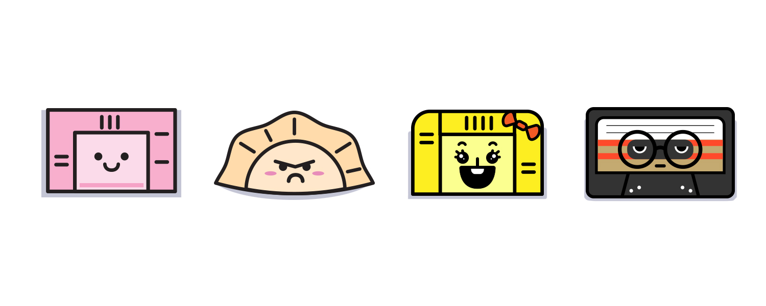
Alex and I did extensive exploration and refinement for the playable characters and obstacles in Sugar. We wanted all the characters to have some kind of personality that would establish a connection between the game and the user. The solution was to add facial expressions and verbal speech bubbles to bring the character to life. Giving facial expressions and verbal responses give a sense of investment for users. It creates a sense of empathy between the user and the character. From there, we began designing a handful of fun, charismatic characters that players could enjoy.
In-Game User Experience
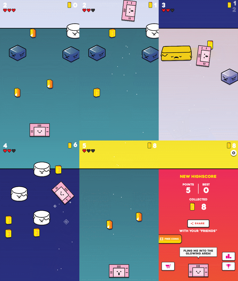
Although Sugar is a simple mobile game, we still went through the process of building the high-level user flow in order to visualize the overall user experience. This helped us pinpoint all use cases and scenarios throughout the game.
High-Fidelity UI & Prototyping
Alex and I collaborated on the branding and game design for Sugar, including the character design and assets. We also placed a large importance on the user experience and gameplay mechanics, and I created the prototype animations for the developer to build from. All music and sound effects were created by me but Alex and I worked together on finessing the perfect sounds and music for the game.
Development & Testing
We meticulously designed every single bit of interaction animation to help us communicate our ideas to our remote developer. We even made sure all the fine details in how speech bubbles would animate, the sugar particles, table transitions…etc., were perfect and matched our mock ups.
Our Developer would send builds and we would user test, log our feedback, build new assets and animations, and he would send us new builds again to approve or iterate on.
Official Launch
Sugar officially launched in March of 2017 for both iOS and Android. Within the first week, we had over 100 5-star reviews from mobile gamers across the world. The overwhelming positive response prompted Alex and I to continue improving on the game by designing new features, characters and obstacles.


