Overview
TM1 Sales was designed to consolidate the functionality of two legacy systems while providing an efficient user experience for window agents to sell tickets. It was essential for the app to perform selling and customer support workflows quickly on both desktop and tablet so the box office could move as many people as possible into the venue on high traffic days and prevent a backup of people waiting in line.
Research
By the time I joined this product team, the selling functionality of TM1 Sales was already released as part of an alpha rollout to 5 participating clients. As part of our feedback loop with these clients, we would have frequent client calls and visits to learn more about how they were using the product. During these feedback sessions, we wanted to learn specifically what the clients liked, what their pain points were, any suggested areas of improvement, and what key functionality they needed in order to make their jobs easier.
The most apparent feedback we gathered from our 5 clients was to add a way for TM1 Sales to handle, at the very least, common customer support functionality such as looking up a customer and reprinting their tickets, picking up for will call, or issuing a refund. Their current method of handling customer support was doing it in the overly complex and dated legacy software. This feedback let us know that having customer support functionality was essential for our users, so that was the next big feature we worked towards.
Legacy system box office agents use to sell sports tickets to customers.
Legacy system box office agents use to sell theater tickets to customers.
User Journey
Working together with the TM1 Sales Product Manager and dev teams, we defined which data points and functionality we could consolidate from the legacy software and work into SalesDeck. With that knowledge, another designer and myself worked together to find the most efficient user experience that would solve 90% of customer support use cases. When the basic user flow was solved, we worked with the developers to ensure the solution was feasible from a technology perspective.
Initial whiteboard of all possible inputs and possible results.
Refined view for engineering to work off of, which shows the input criteria and how they map to specific outputs.
Wireframes
Designing basic wireframes allowed us to better communicate the user flow to the team and discover holes in the logic that we could address early. As initial release requirements continued to evolve, so did the wireframes, and also to a certain extent, the user flow.
Iterative progression of wireframes
High-Fidelity UI
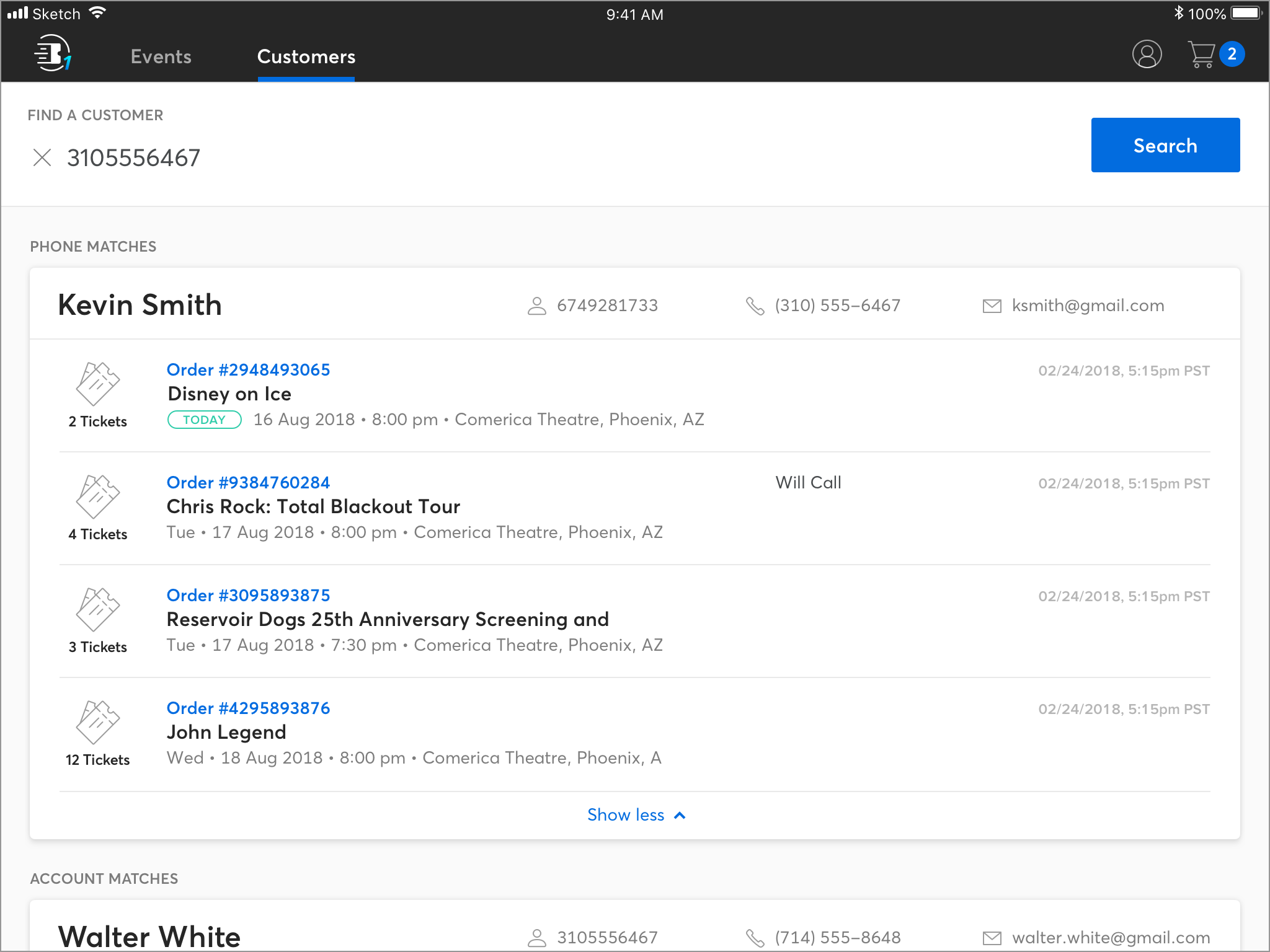
Once wireframes were solidified and agreed upon by all team members, (Designers, Product Managers, Developers) we moved on to design the high fidelity UI. This stage involved syncing visual styles with other Ticketmaster apps, pulling design components from our shared Sketch library, and even inventing new patterns that could be reused global within our suite of apps. As a design team, we communicated frequently and shared our designs often to ensure a cohesive visual experience across all the apps.
Iterative progression of high-fidelity UI
Prototyping & User Testing
Using InVision, we created interactive prototypes to share with participating clients. The tests involved writing very specific but common scenarios in relation to handling customer support issues at the box office. These scenarios included situations such as; a customer wanting to have their will call tickets printed, a customer wanting a refund, a customer wants to pick up will call tickets that were left for him or her but were bought by a different person, just to make a few.
Our main goal in testing was to discover how successful our user experience was for customer support compared to the existing legacy software. In general, our research early on helped us in better understanding our user’s needs, which in turn allowed us to design a user experience that was helpful.
Representation of the user flow prototyped in Sketch.
Feedback & Iteration
User testing with actual clients not only validated much of our design decisions, but it also gave an opportunity for them to voice their feedback on our progress. What we learned from the user feedback was that our initial Iteration of the order details page did not contain sufficient data points pertaining to that customer's order in order for our to actually be useful. These findings lead to multiple iterations of the page, requiring us to work closer with the clients as we fine tuned the user experience for this initial launch.


